


Photo Websites: How I make mine stand out
Photography Website secrets that will help you stand out and more photography clients

I’ve made a video that reveals some of the secrets of having a successful photography website. Let’s break it down and see if this can help you with your photography business. By the way, my S.T.E.P. Pricing Course will save you on your photography pricing. You can get that here.
Merging two important pages: Selling isn’t what they’ve told you it is. It’s about being a convenience for potential clients and making their lives easier. One way to do that is to merge the ABOUT ME Page with the CONTACT Page. Why is this? Because most of the visits to your website are via mobile.
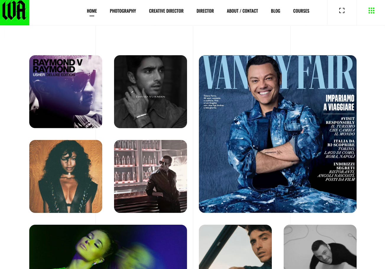
Imagine now the mobile user reading about you on the About Us page and agreeing to contact you. But there isn't something there so instead they have to reach for the little hamburger feature at the top of the page and find the contact page one simple step could prohibit somebody from contacting you because, quite frankly, they are lazy. We're all a little bit lazy. So they'll consider doing it later but later never comes. Instead, merge the two pages. Once they read about you, right below that should be a way to contact you. Eliminate all barriers to entry.How many website galleries: simply put, if you can't convince somebody to book you in the first three galleries then there are other issues. Sometimes it's the quality of the photographs or the selection of photographs. it's not always about quantity. For my students in my courses, we've learned that quality is what books the clients.
The Ikea method: the only people who like to trap are hunters and ax murderers. We shouldn't like to trap anyone. That means when a client reaches the end of a gallery on your website, there shouldn't be a dead end if there is, there are more dead business deals. Instead, follow what IKEA does, they guide you through the entire store, whether you like it or not. So once a potential client reaches the end of your image gallery, provide two choices for them. This way they're not trapped, they don't feel trapped, and you get to guide them to the next logical step. That next logical step should either be another gallery or it should be the contact/about page.

The boring bio: I'm trying to figure out how to say this respectfully but here we are… I'll just say it in a very blunt way. Nobody cares about when you pick up your camera. Nobody cared about when I picked up my camera. Nobody cares who gave you the first camera or how you felt the first time you took a photograph. You felt good that's why you're still doing somebody gave you a camera because how the hell is a very young person supposed to afford a nice camera?
Consider doing a 90-second video that talks about how you will become an answer to the problem they have or the one they're about to have and don't even know about it. Use that opportunity to break the fourth wall. Use the opportunity of speaking on video so they feel warm to you and the first interaction seems more familiar, and you can increase your odds of booking.Gallery image total: less than nine images are lazy and unqualified. Over 14 images show that you're hoping they might like something and even you're not sure. Try to stay between nine and 14 images.
Keep Photo bookings at 50%: This one isn't exactly website-related. It does start from the website and it’s a percentage of the booking process. Make sure you are booking the right percentage of inquiries to see that your pricing is in the right place. And if you want to master pricing check out my S.T.E.P. Pricing Course here.
Can’t thank you enough for sharing this with me and again here! I have followed “most” of your items here. 😉. It did matter and made a difference. I still need to edit but that’s always ongoing for me bc I like to add new work. But for those of you who need to do this , do it. Walid knows!